Alto
Visual Identity, Strategy, Illustration, UX/UI, Web Design
Alto is the UK’s leading property CRM platform for estate agents, and in 2024, I was tasked with refreshing its brand identity. A mammoth os a project, I collaborated with product designers, senior leadership, UX researchers, sales reps, and marketing to uncover who we wanted Alto to be. After months of research, interviews, surveys, and workshops, we landed on a core truth: Alto is your trusted partner- reliable, human, and built to grow with you.
The visual direction was rooted in two core ideas: our heritage and solid foundation, and our progressive, future-forward outlook. Together, these position Alto as a reliable framework- one that supports your branch, grows with your needs and adapts seamlessly to your daily tasks.
We paired serif and sans-serif fonts to reflect both our heritage and innovation, introduced a vibrant colour palette with improved accessibility, and built a flexible design system. Based on team feedback, we developed secondary and tertiary palettes to offer greater creative flexibility, especially across digital and product environments. Our graphic language includes surreal illustrations, the "curve" device, and a full suite of scalable assets- empowering 250+ employees across 8 departments to stay visually consistent while remaining creatively expressive.
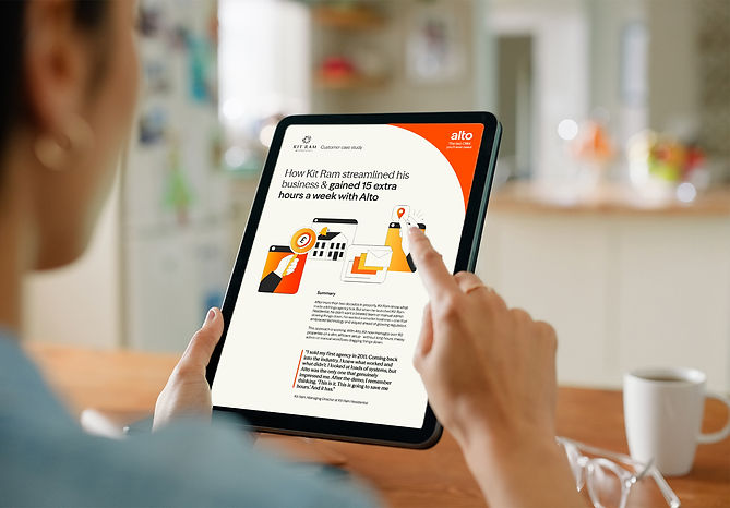
A key challenge was visualising the product without relying on traditional UI screenshots or stock photography. We solved this by taking creative license- styling product elements in a simplified, modern way that feels fresh yet familiar. The result is a confident, cohesive identity that’s warm, human, and distinctly Alto. Designed to evolve with the product and resonate with teams, agents and customers alike.
Website